Rotterdam 2036
A logo and brand identity for the 2036 Summer Olympic Games, honoring Dutch culture and Rotterdam's remarkable resilience.
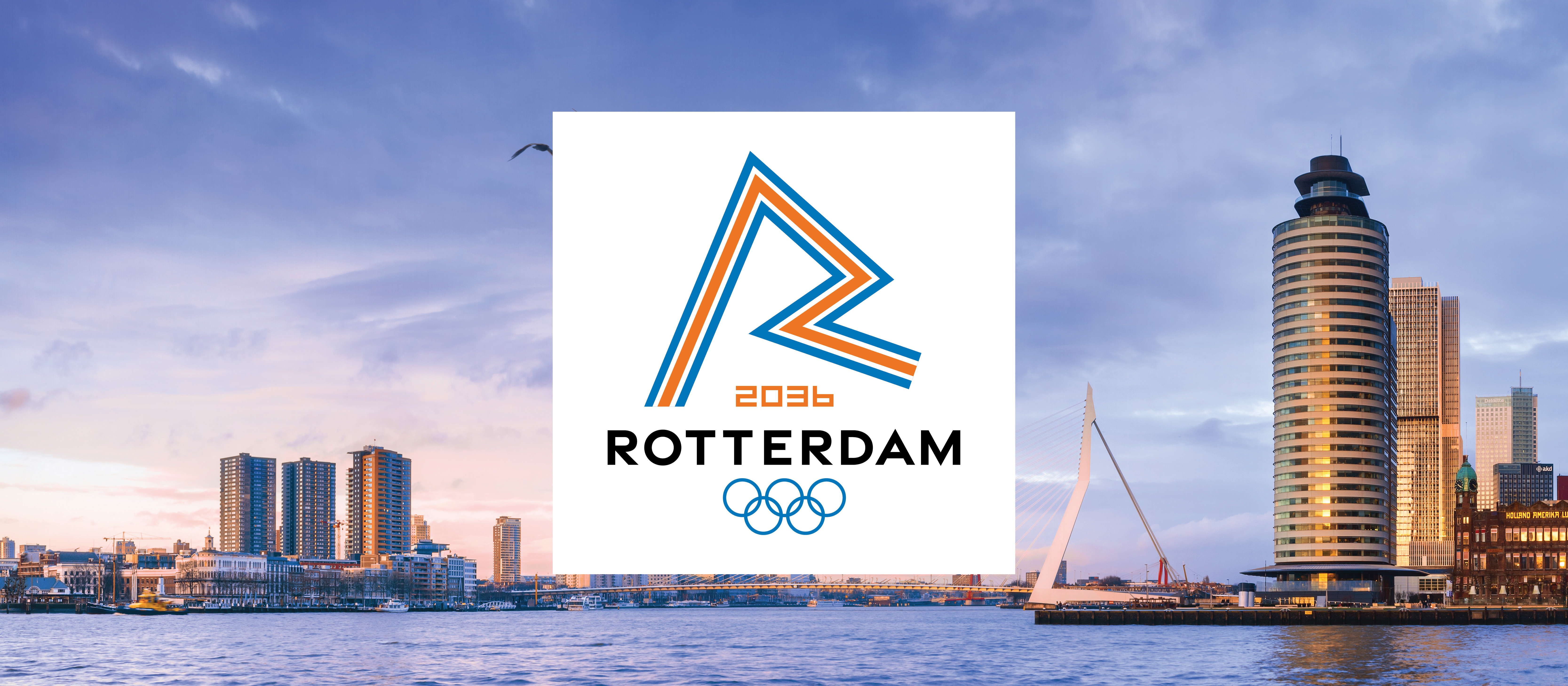
A logo and brand identity for the 2036 Summer Olympic Games, honoring Dutch culture and Rotterdam's remarkable resilience.
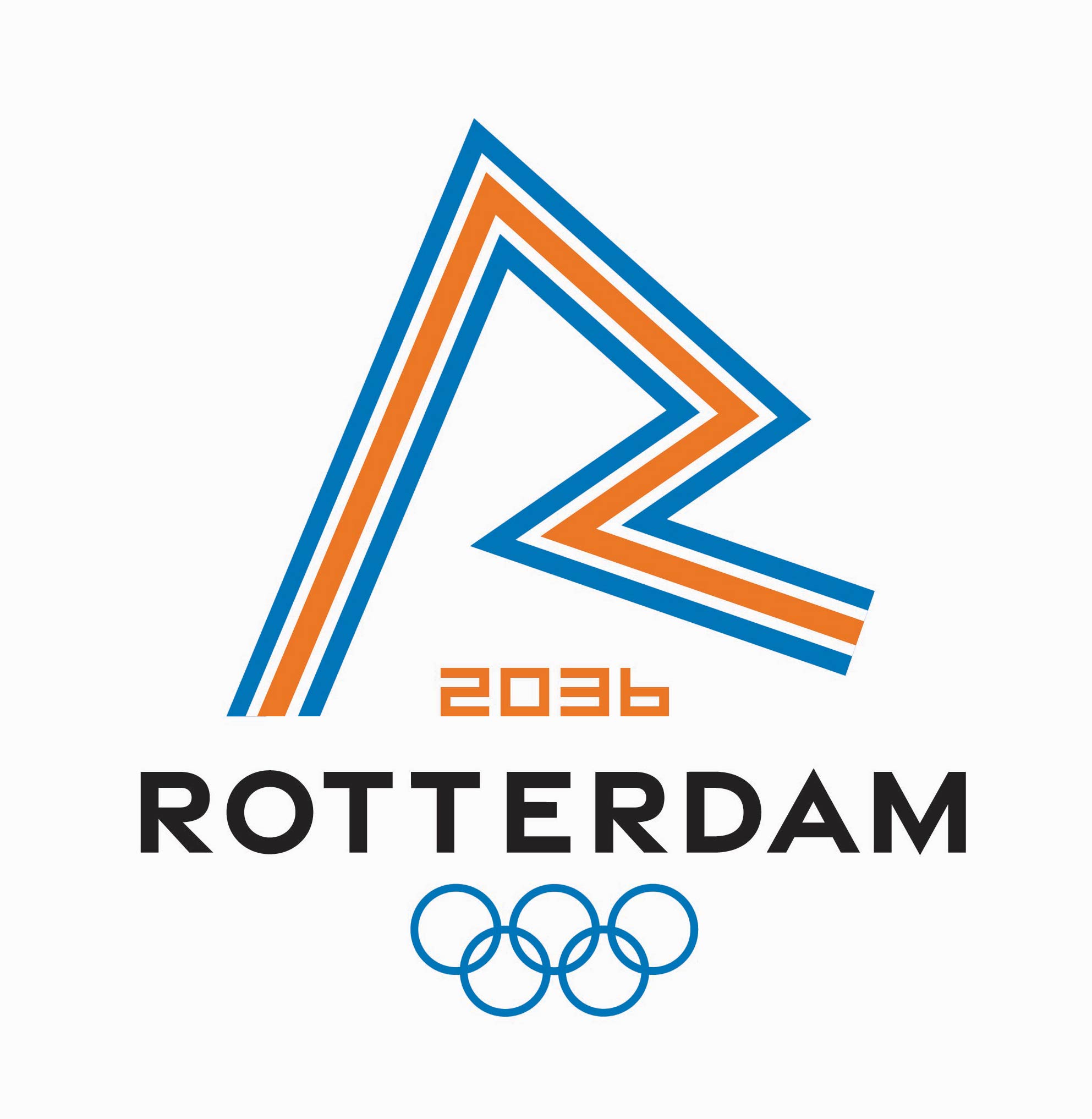
Rotterdam 2036 is a logo and brand identity designed for the 2036 Summer Olympic Games, with Rotterdam, Netherlands as the host city. The project called for a mark that could represent an international event while staying deeply rooted in the culture, history, and spirit of the city itself.
Design a logo for the 2036 Summer Olympic Games with Rotterdam as the host city.
The development of the logo was inspired by Rotterdam's architecture, namely the Erasmus Bridge, and the history associated with its creation. The bridge, a landmark of the city's skyline, became the central visual reference point for the entire identity.
Three color names guided the creative direction throughout the process:
The logo serves as an homage to Dutch culture and a tribute to Rotterdam's resilience and courage. Inspired by the Erasmus Bridge and the city's remarkable rebuilding after World War II, it symbolizes the connection between modernity and history.
The mark balances the dynamism of an Olympic Games with the quiet strength of a city that has always rebuilt itself forward.
The final Rotterdam 2036 Olympic logo.
The brand palette was drawn directly from Rotterdam's character: the dark charcoal of its industrial roots, a blue drawn from the original Netherlands flag, and a warm orange as a nod to the national color of the Netherlands.
Urban
Maas
Dutch
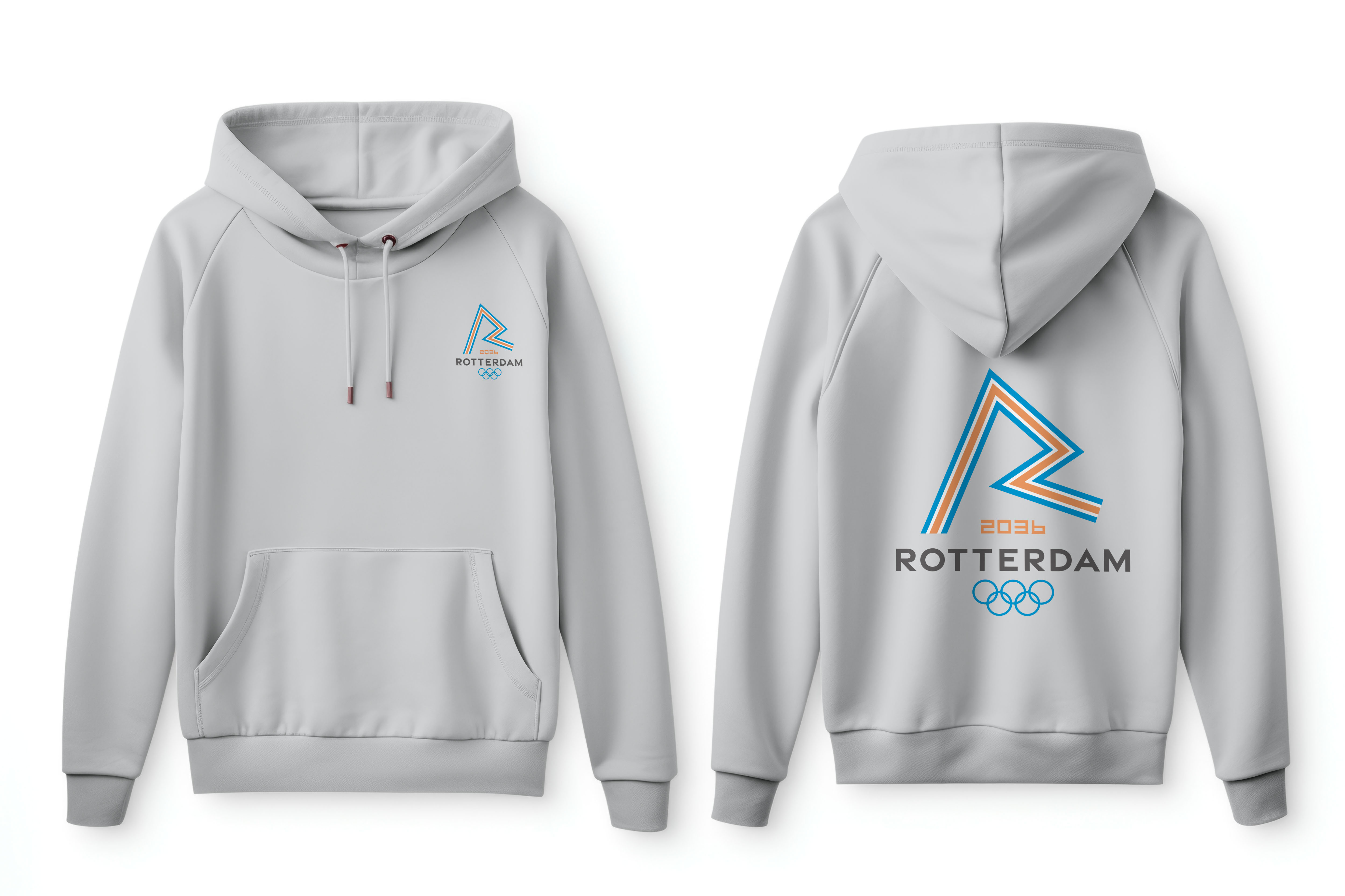
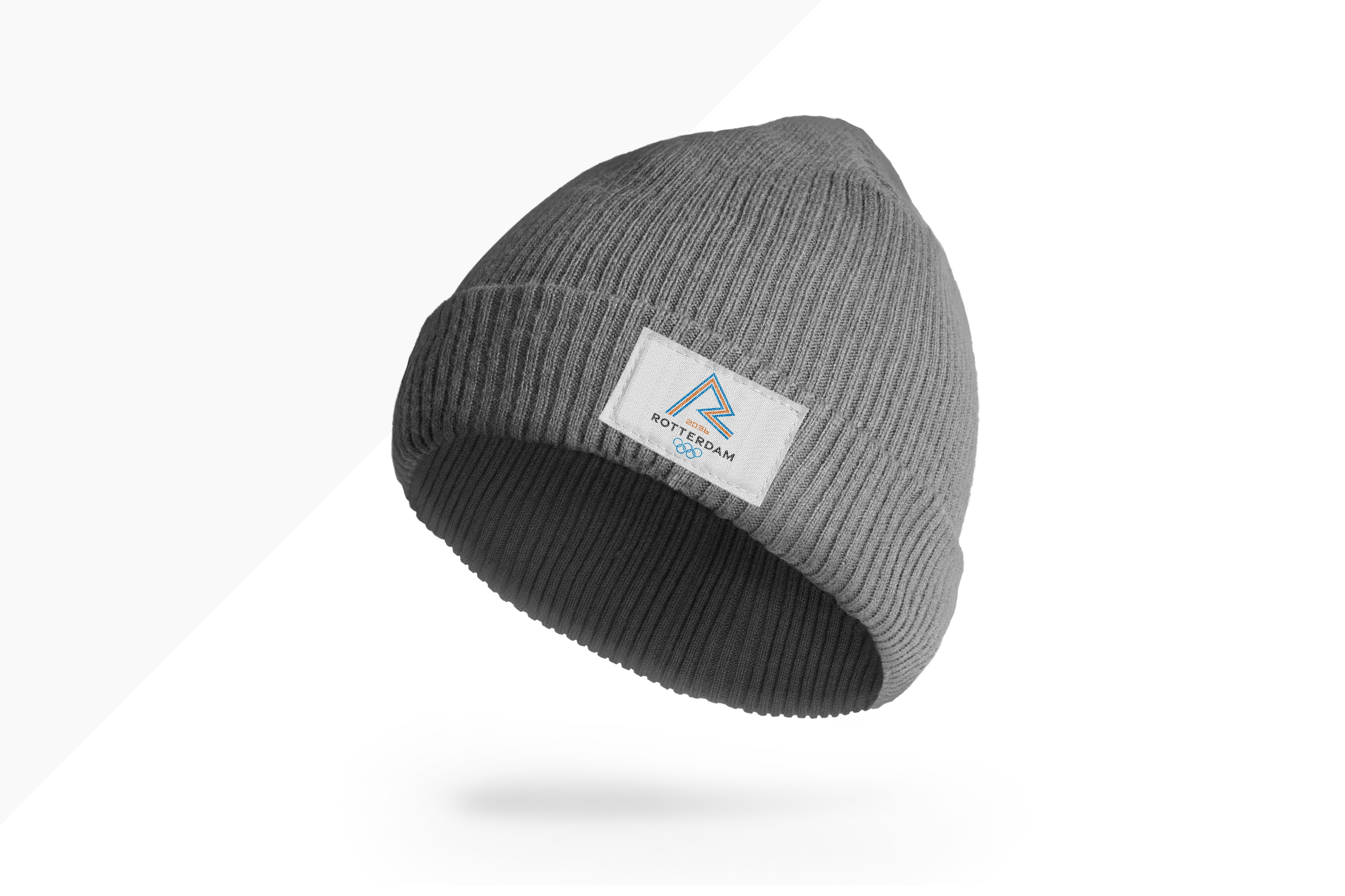
From posters to wearables, the Rotterdam 2036 identity was applied across a range of touchpoints to show how the brand lives beyond the logo.
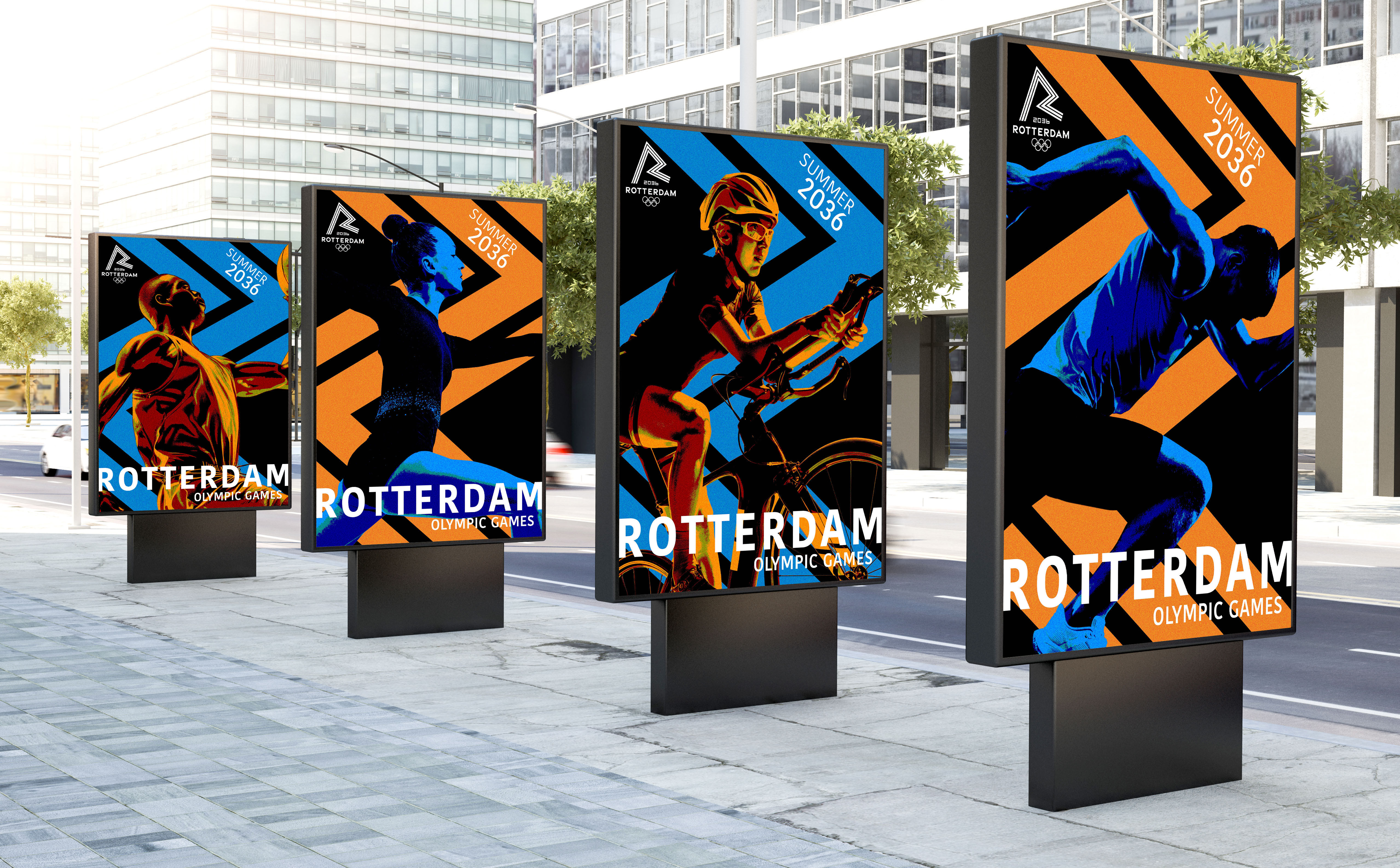
Official poster applications.
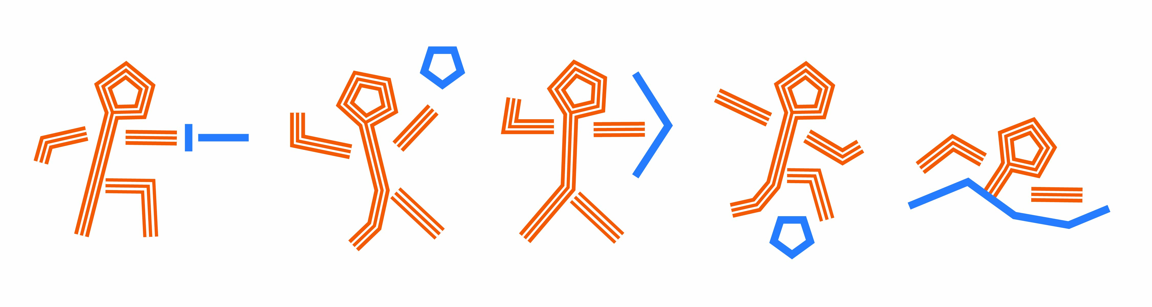
Olympic sport pictograms developed for the Rotterdam 2036 identity.
Wearable merchandise applications.
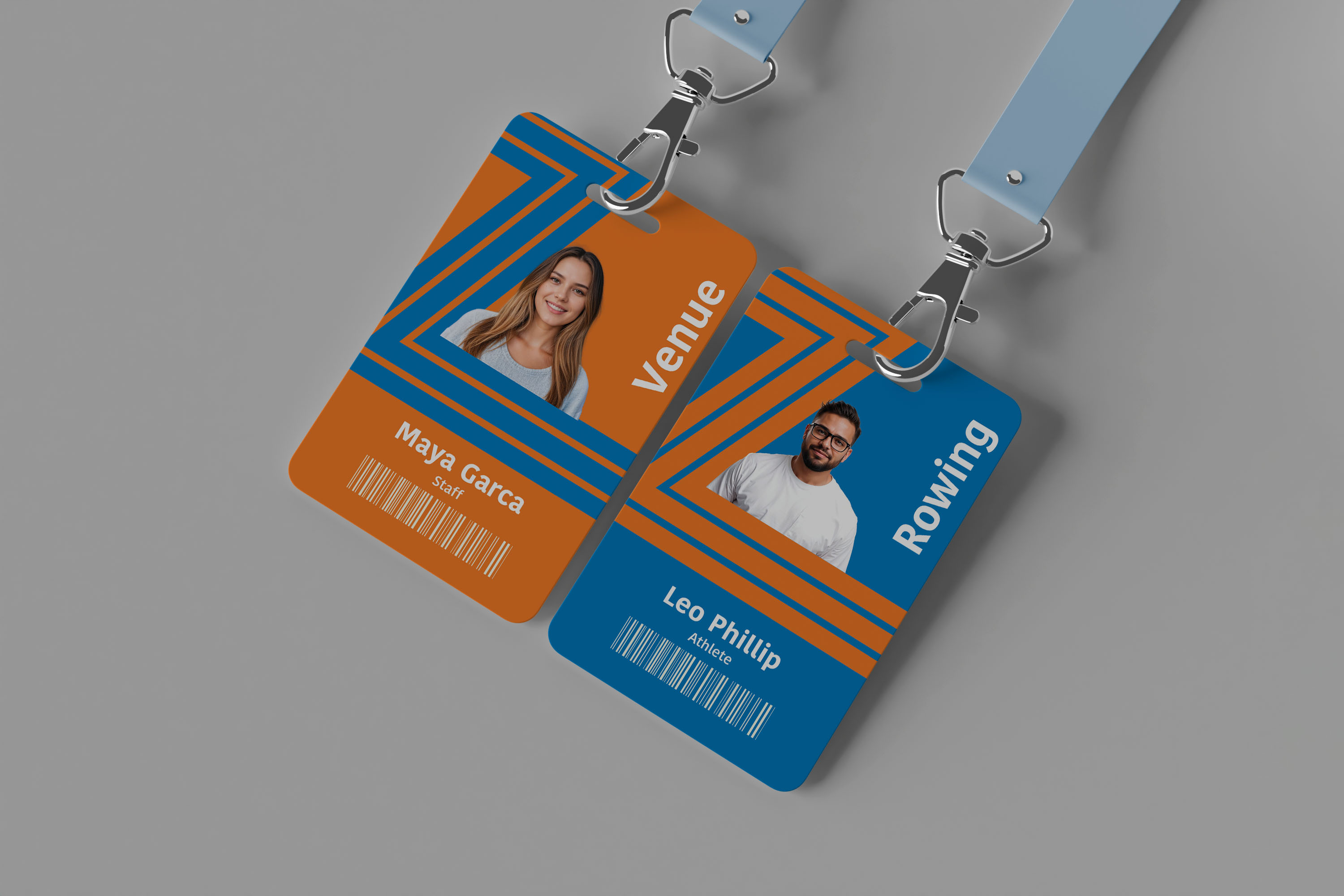
Accreditation ID card.